Designer Showcase
Final Renovation Reveal: Amy's ORC for Fall 2020
My design loving friends: finally, we've come to the final renovation reveal day for the One Room Challenge (or in this case, the much delayed several room challenge). While any homeowner will tell you the work is never done, we're feeling pretty pleased with where we landed in 3 short months and a lot of long days. Through this blog only covered the main kitchen and bathroom renovations, in the last 3 months, my husband and I also renovated a basement, a shed/office, reroofed the house, reinforced the chimney, refinished the wood flooring, painted all the interiors, added a 2nd half bath and laundry room hook ups....among other things. Deep breaths.
While we're on the subject, let's take a walk down memory lane, shall we?
The original wood cabinets were functional and pretty, the kitchen was small and boxed in.
High on the wish-list was a walk-in shower but since this was the main bathroom, we couldn't afford not having a tub. Enter the clawfoot.
A very very long process but things really start to come together with the drywall eh?
Cabinets in, moving in-progress...
All of which leads us to today. I'm so thrilled to share the final renovation reveal (so I can take a nap)!
Kitchen Reveal
Let's start with the kitchen. Remember the before? That wall came out to make way for a giant island, a large support beam was added and the sink and oven positions were swapped.
And here's how it looks today:
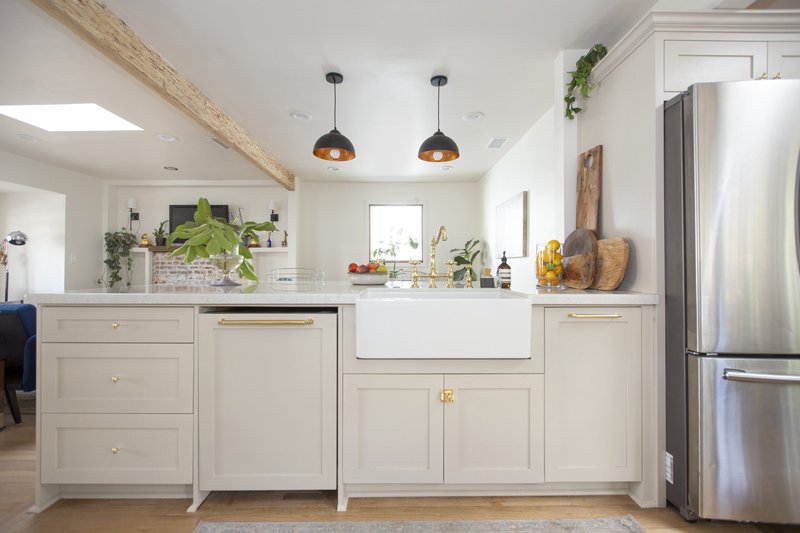
*HEART EYES*
The BRASS! Swoon.
I thought about photoshopping that dishwasher gap but decided to keep it real. Currently, the dishwasher is not working properly and we're awaiting a backordered replacement part, and thus, it is not fully installed. So please imagine that the gap doesn't exist but also know that sometimes things don't work like you imagine and you gotta just roll with the punches, ya know? We can't all have flawless homes all the time, RIGHT?!
But check out that 15" Unlacquered Brass appliance pull. That beauty is from Schaub & Company from our Haniburton Collection and she's heavy and will patina like a dream. The Egg Knobs are also Unlacquered Brass from Emtek, as are the Cabinet Latches, proving once and for all that you CAN mix collections and brands if you order samples to confirm finish matches first!
Faucet is from Wayfair and by Kingston Brass in the Polished Brass color, while the single-basin Fireclay 30" farmhouse sink is from Overstock's Highpoint Collection. Cabinet Color is a varnish version of the Revere Pewter by Benjamin Moore and I love it!
Now back to the before...This poor window and sink across the middle of the kitchen....
NOW, looks like this:
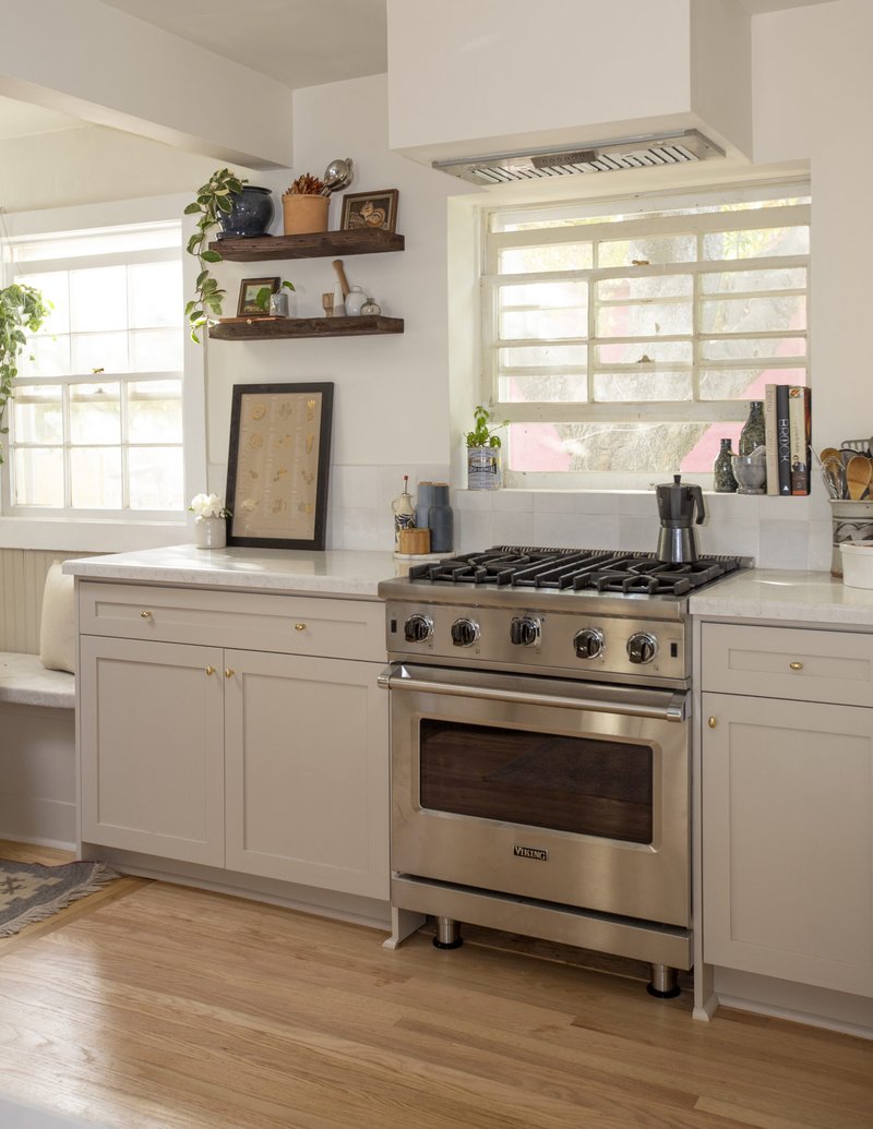
ahhhhhh, the light!
Deep sigh of relief. That space on the left is perfect for prep and the kitchen now receives so much light. We ordered a basic insert cabinet ventilation hood then covered it in drywall for a seamless look.
Backsplash tile is the Cloe tile from Bedrosians in White and I think I'm still debating continuing it to the ceiling. What do you think?
Viking Range is a dream. My mom is a professional chef and I had very vivid memories of when she installed her, albeit much larger, Viking Professional Gas Range in the 1990s...it was a real full circle moment for me.
Kitchen/Dining Nook
You can see a glimpse of it here, but we decided to have the cabinet installer also add in a beadboard backing behind the bench cushion and I love how it turned out. Here's a better view:
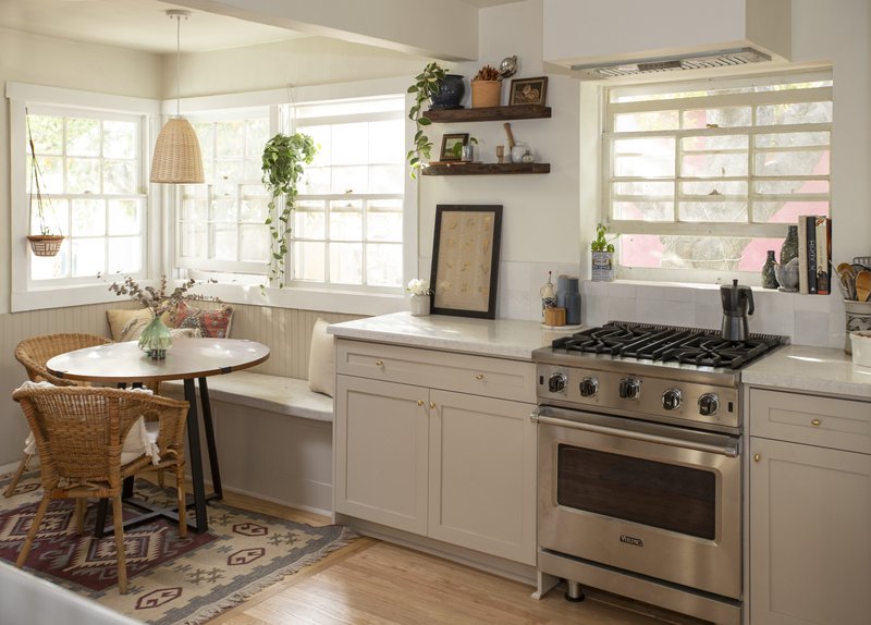
The coziest breakfast nook.
We kept the original cabinets here because I couldn't bear to part with them and I loved the warmness that the wood brought in but there is definitely some wonkiness in how they open and close. A project for another day. :)
That rug is something my husband lugged back from a business trip to Turkey-- I wish I could share the source! The rattan light is from Amazon, chairs are Ikea, table is Joss & Main from pre-move and no longer available.
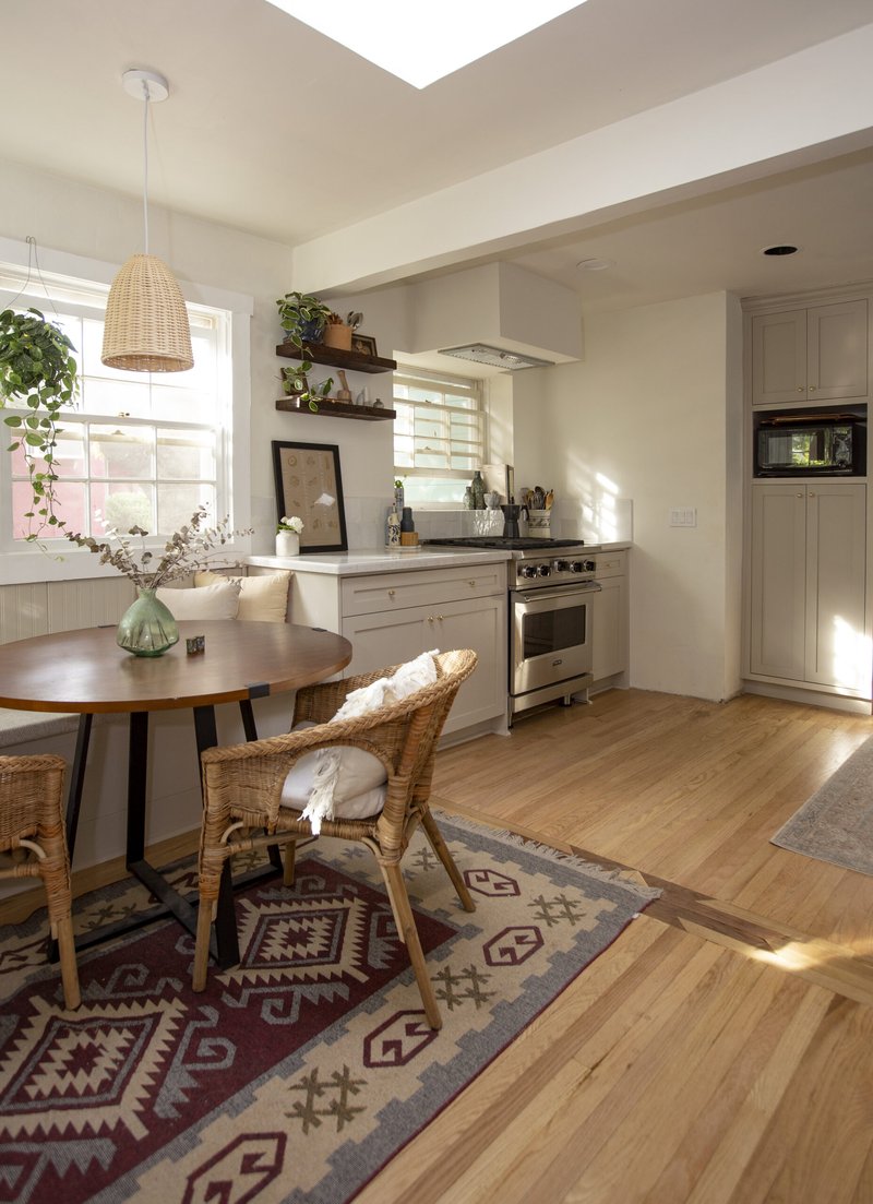
Skylight 1!
There is now a pantry where the fridge was in the original images, as well as a microwave nook. This may be temporary but I've found a microwave to be essential for takeout leftovers during COVID (ya feel me?).
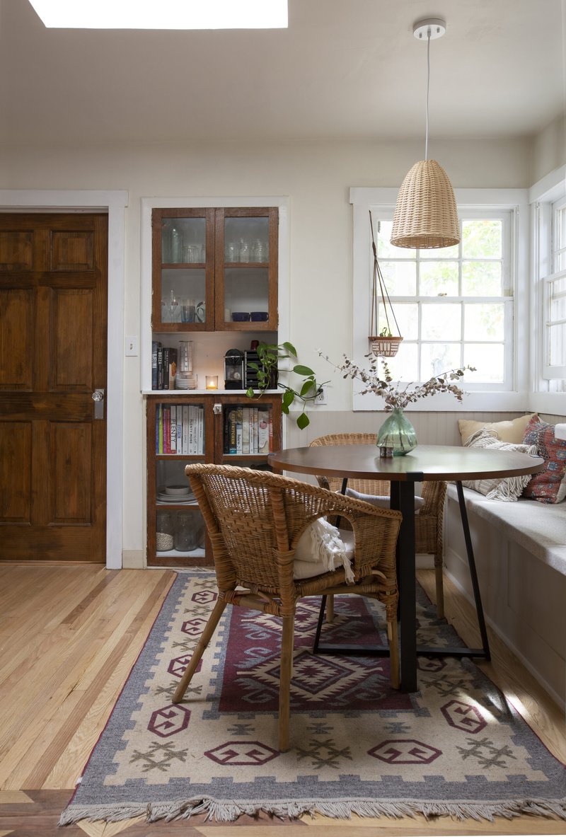
A small glimpse of a very large cookbook collection
Bathroom/Hall Reveal
Moving towards the hallway, we have our first peek at the 2nd main space: the bathroom!
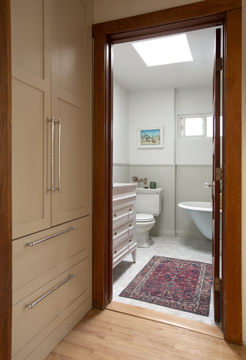
Storage FTW!
These pulls on the linen closet are also from Schaub & Company's Chemin de Fer Collection in a Britannium finish. Britannium is a pewter alloy first produced in 1770 and that was used commonly to manufacture cast silver household items. Fun fact: until 2016, Britannium was the core material in Oscar Statuettes! And like unlacquered brass, this is an unlacquered material that is mean to age and patina over time (but can also be polished!).
It's got some really fun texture and details. Truly one of my favorite items Schaub offers!
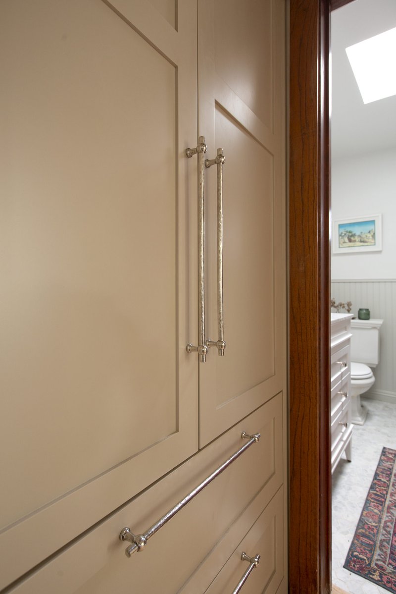
Chemin de Fer Pulls from Schaub & Company
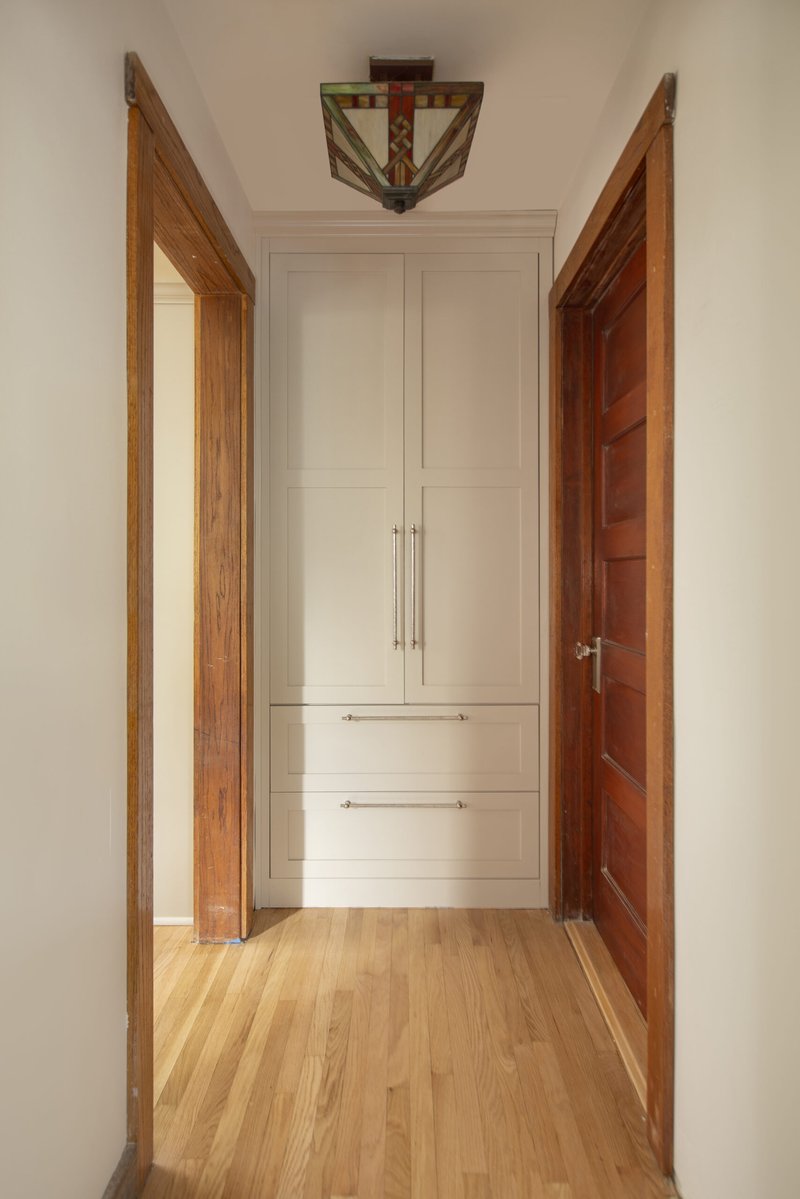
Don't mind the painters tape on the bottom left of the door frame....! *Slaps forehead!*
The door hardware is Emtek's Quincy non-Keyed 7-1/8" Overall Sideplate with the Old Town knob in Satin Nickel. Because we were sticking with the original doors, we wanted them to look like they could have been original to the 1925 house.
Let's take a closer look here....
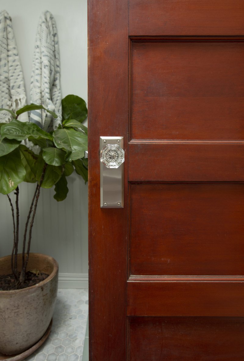
Sideplate locks offer longer backplates than Emtek's standard rosettes.
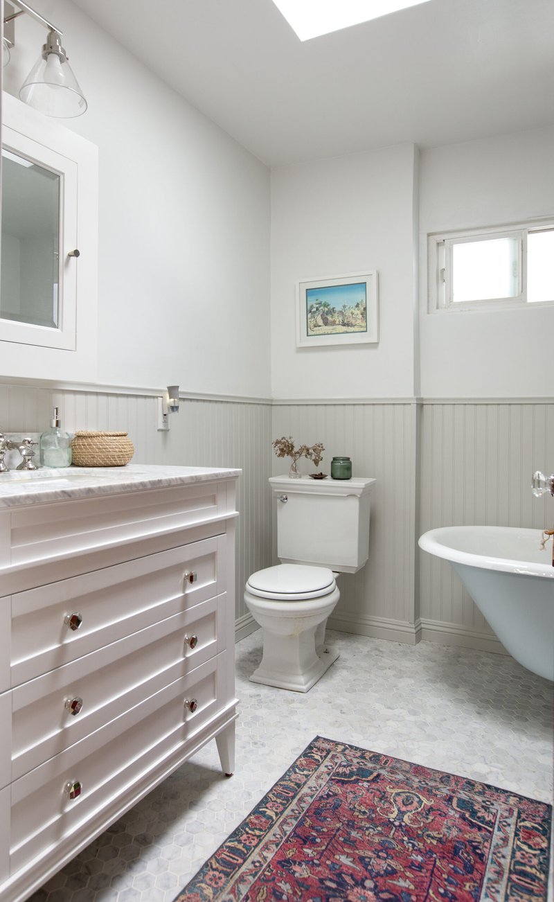
Lotta marble.
The bathroom is a little tight (7'x7') but we managed to fit in both a walk-in shower, a larger vanity, a Kohler transitional toilet, and a CLAWFOOT TUB!
That vanity is also from Joss & Main but unfortunately no longer available. We upgraded the standard hardware with Schaub & Company's Menlo Park Polished Nickel Faceted knob. Lighting fixture is the Alba 2-Light Dimmable Vanity Light also in Polished Nickel and the Medicine Cabinet is the Palmer from Rejuvenation with beveled mirror in Polished Nickel. Unfortunately our installer lost the original latch it came with but I added the Emtek Cone knob in Polished Nickel and-- good as new!
All tile is Bedrosians: Floor is the White Carrara 2" Floor Mosaic and the shower shall is the Costa Allegra 3x6" Tile in Gulf. The color makes me so happy!
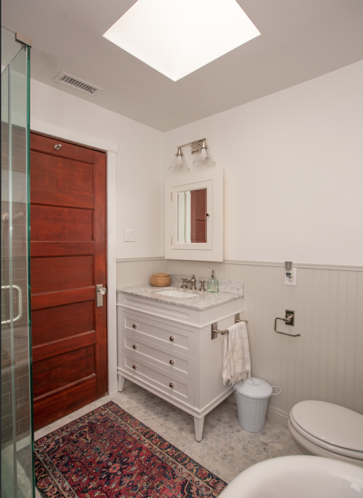
SKYLIGHT 2!
I also added an Emtek 12" Towel Bar and a Transitional paper holder (both with a Rectangular rosette in Polished Nickel) to ensure all the finishes and styles were cohesive throughout the space.
I painted the wainscoting Gray Owl from Benjamin Moore and the upper wall is Decorator's White. Unfortunately, it's not the original paneling that I had wanted to salvage... it was a mess after we demo-ed the bathroom. But here's a flashback to what we were working with before:
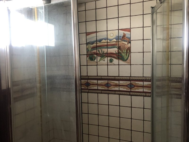
The infamous coyote tile!
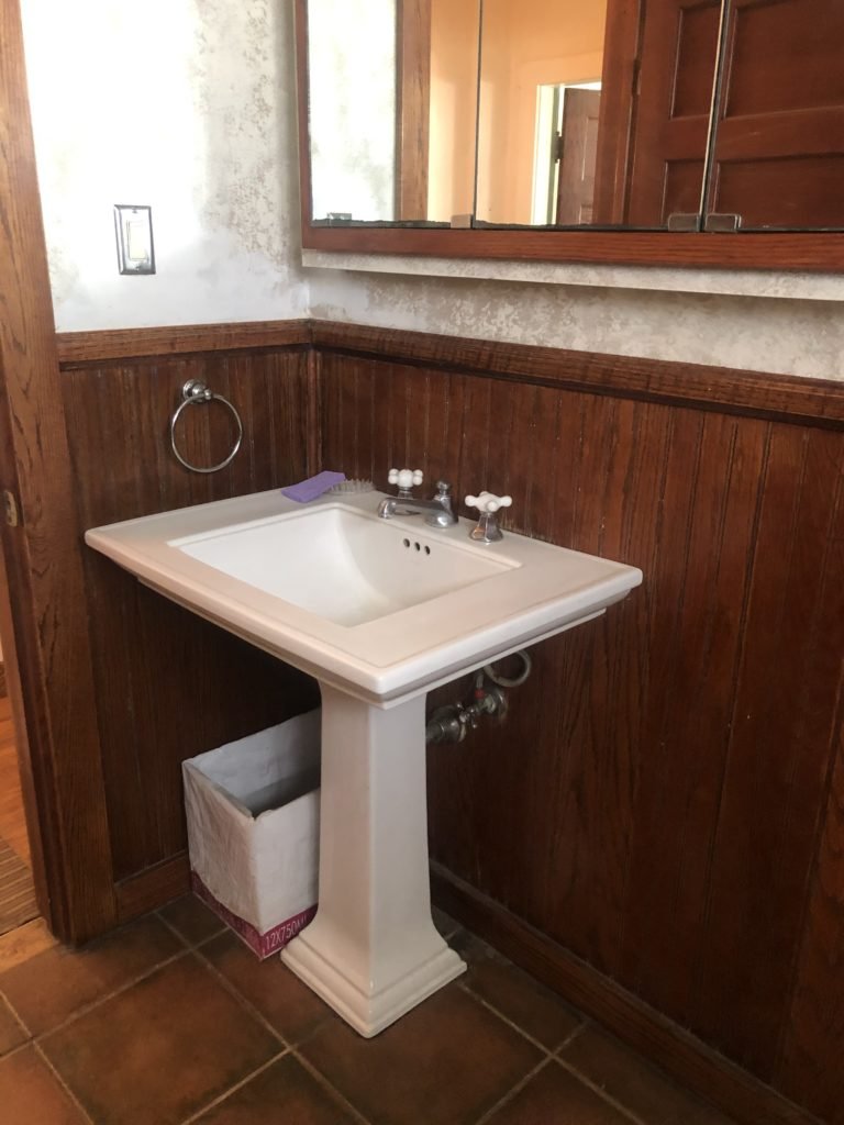
Wine box as trashcan. Surprisingly, not my idea.
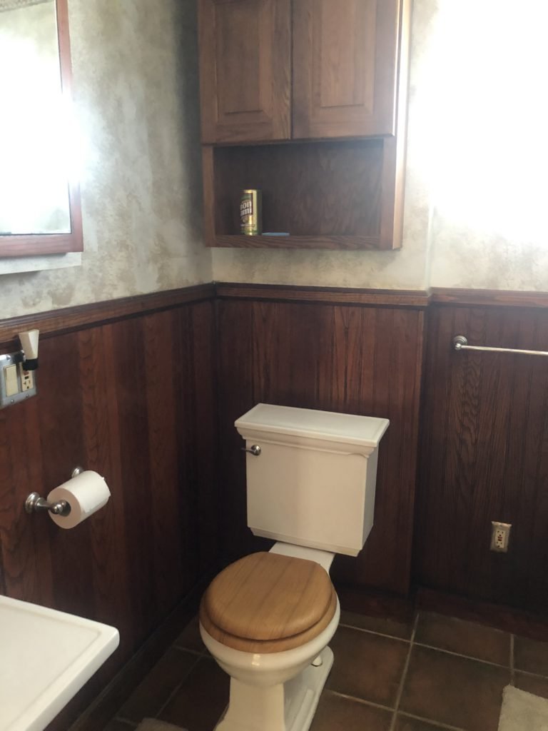
A whole lot going on here in between the tile, panel, wall treatment, etc...
So I'd say that's an improvement.
Welcome to the new space!
Now let's pan out a bit. While the living room wasn't formally part of the challenge, I figured we could do a little intro to the space from the front.
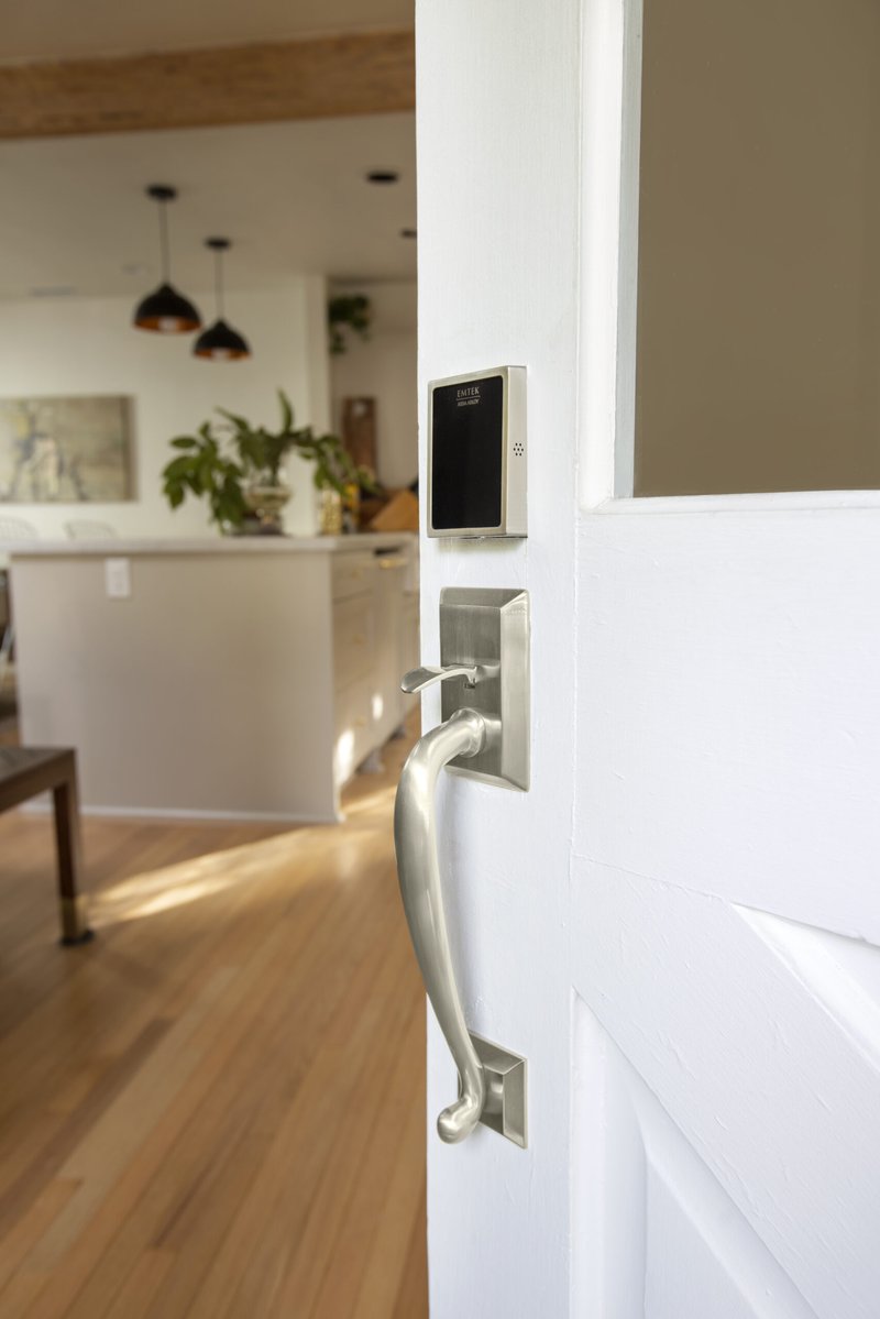
Getting high tech!
This EMPowered smart lock with the Franklin Grip in Satin Nickel was a lifesaver when we were under construction. We could set up separate keys for each contractor and grant permission to certain phones. I am not super tech savvy but I couldn't recommend enough! A great alternative to re-keying.
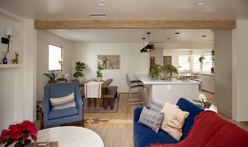
Living room view
I'm still trying to find the right fit for the counter stools and couch but baby steps. Thinking maybe some grasscloth wall paper in that dining room too? To borrow from Winston Churchill--"Perfection is the enemy of progress". I will almost certain compulsively swap art too. In fact, I already have another piece mounted here behind the dining table. A constant work in progress.
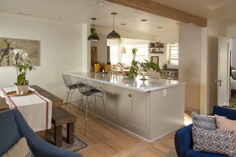
Wide open spaces.......! *cue The Chicks*. Also another peek at some of those cabinet latches.
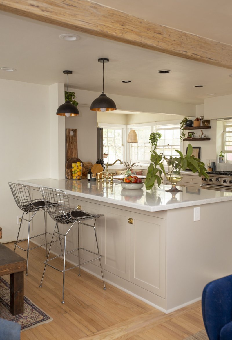
I don't think I will ever run out of storage in this island.
Countertops are Pearl Jasmine Quartz from Silestone and much vein-ier and gray than they look on camera.
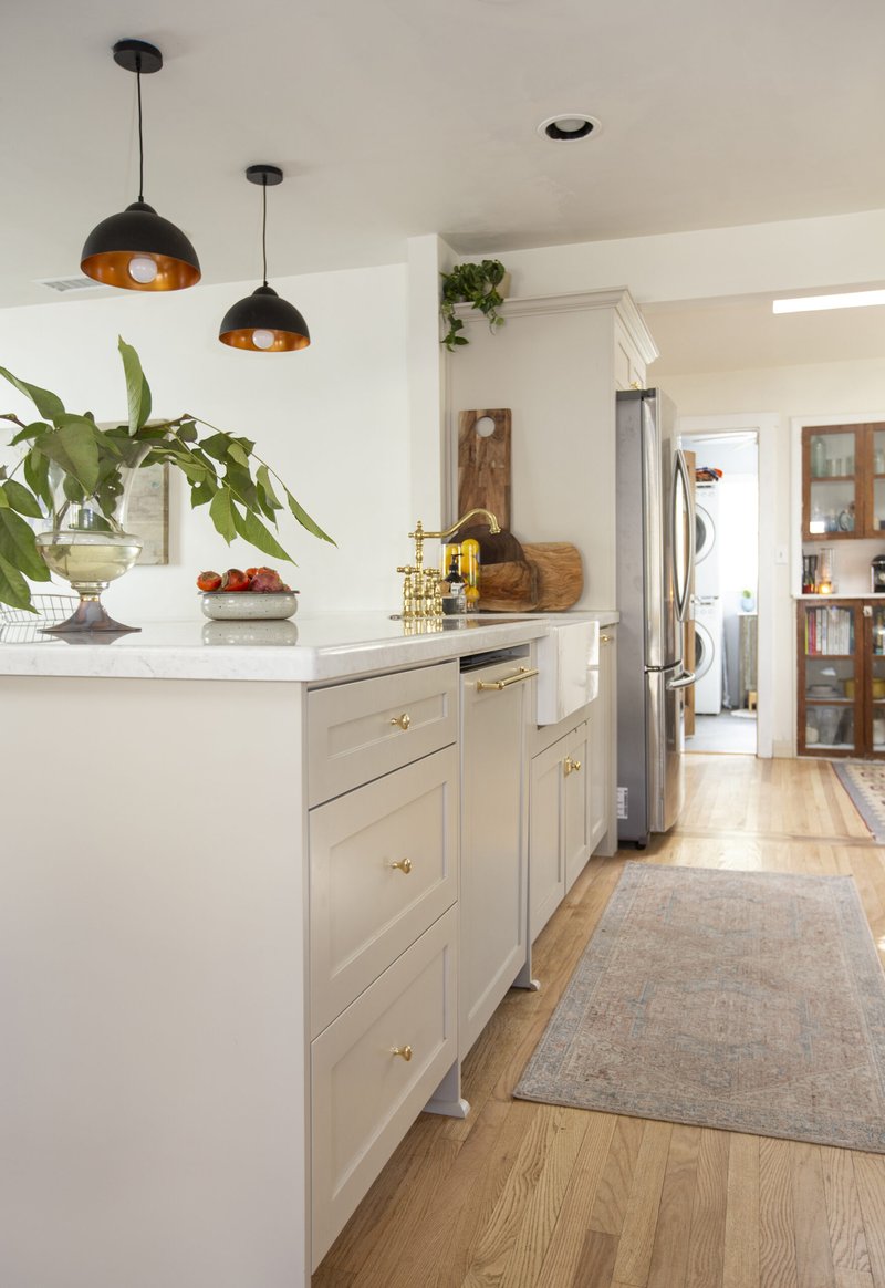
Straight through to the laundry room!
And that's a wrap for now! Here are some candid shots of me in my new kitchen(!) with appearances from my sweet parade of dogs and cats.
Dakota the husky, Bongo the cat, and his sister Wally (with photobombing by Dakota)
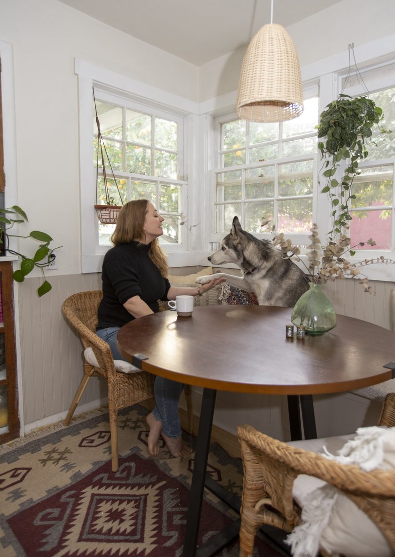
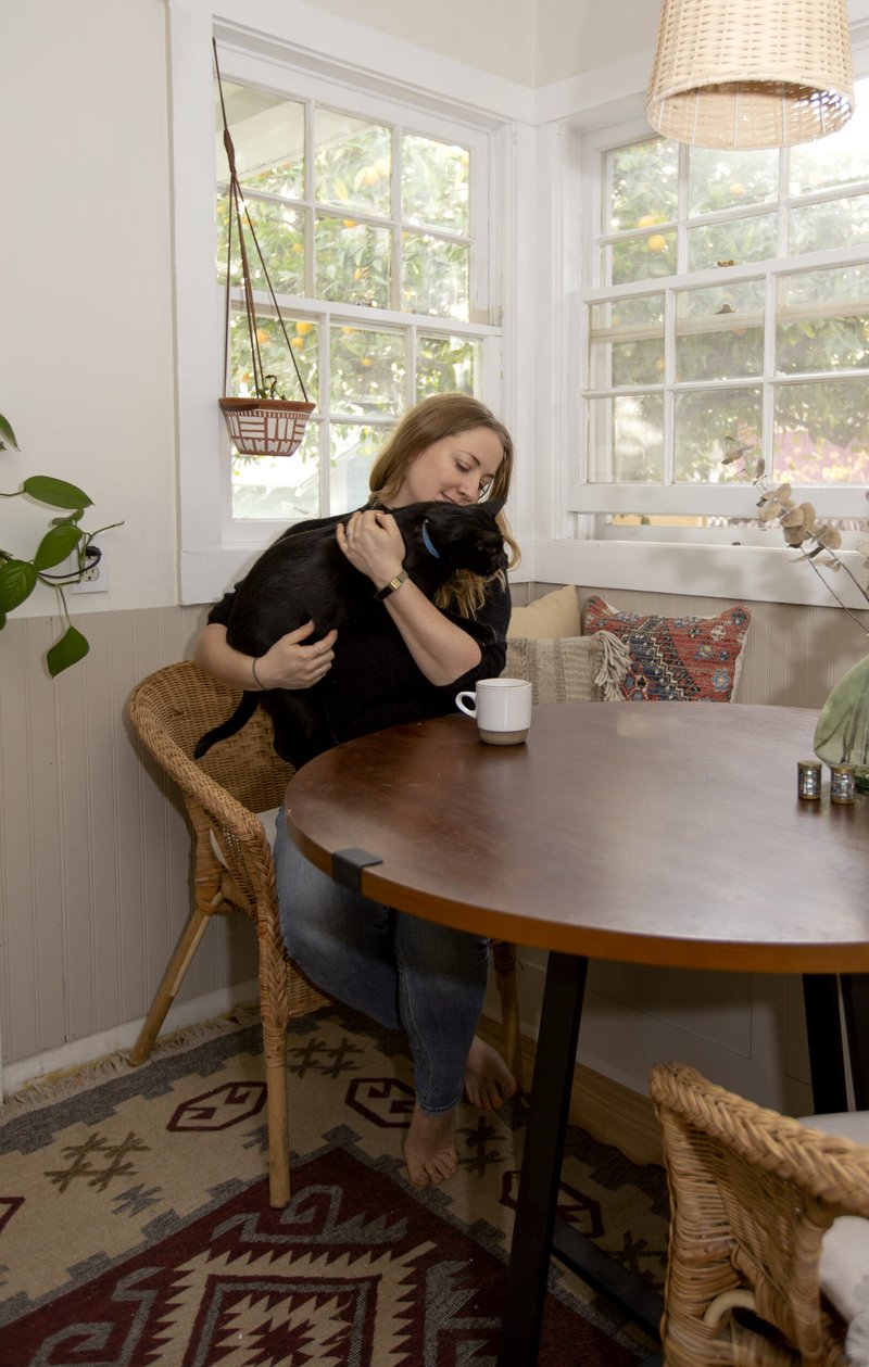
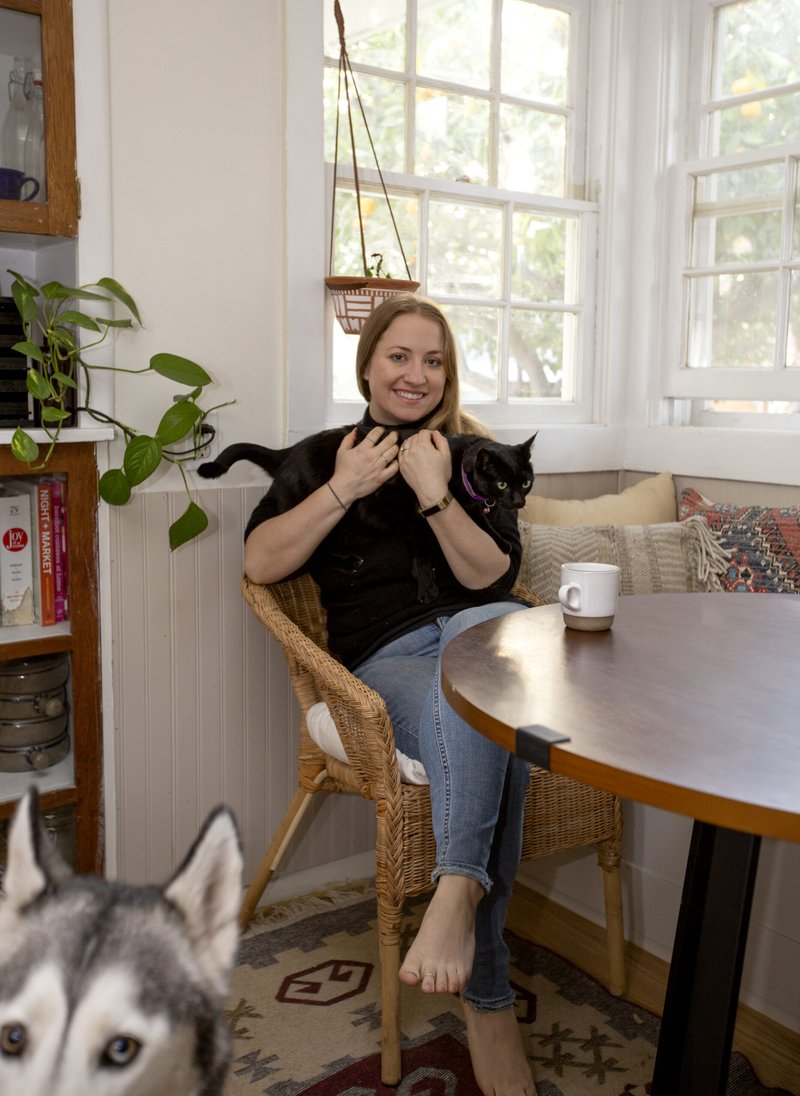
Thank you so much for following along with my final renovation reveal and the journey to get here. This was so much fun so participate in and I'm so relieved to have a place to share the trials and tribulations of a pandemic move and renovation.
THANK YOU!
If you haven't already, please check out the final reveals from all the featured designers here:
Albie Knows | Ana Claudia Design | At Home With Joseph | Barbour Spangle Design
Dwell by Cheryl | Eneia White Interiors | Gray Space Interiors | Haneen’s Haven | Hommeboys
Interiors by Design | Jana Donohoe Designs | Laura Hodges Studio | Lauren Nicole Designs
Nicole White Designs | Nikole Starr Interiors | Nile Johnson Interior Design | Prudence Home + Design
Thou Swell | Traders Haven Design | Whitney J Decor | HPMKT
Special thanks to High Point Market, media sponsor Better Homes & Gardens and of course, the One Room Challenge, of which we're always thrilled to be a sponsor each season.
Appreciate you following along!
xo,
Amy